PROBLEM
The problems that potential pet adopters face:
- Many people adopt pets without understanding the magnitude of responsibilities that are a part of pet adoption.
- Potential pet adopters may not know which pet is compatible with their lifestyle and end up making bad choices.
Why is this a problem?
The lack of understanding responsibilities and making poor choices leads to unfortunate surrendering of pets. The adopter's time, money and effort is spent in the process and the poor pet will not have a home any more.
SOLUTION
We designed a website that solves all of these problems. We call it Pet-ential. This website provides potential pet adopters a gateway to pet adoption through an education process, a quiz to check their adoption readiness and provision of pet recommendations.
MAIN FEATURES
Education of Responsibilities
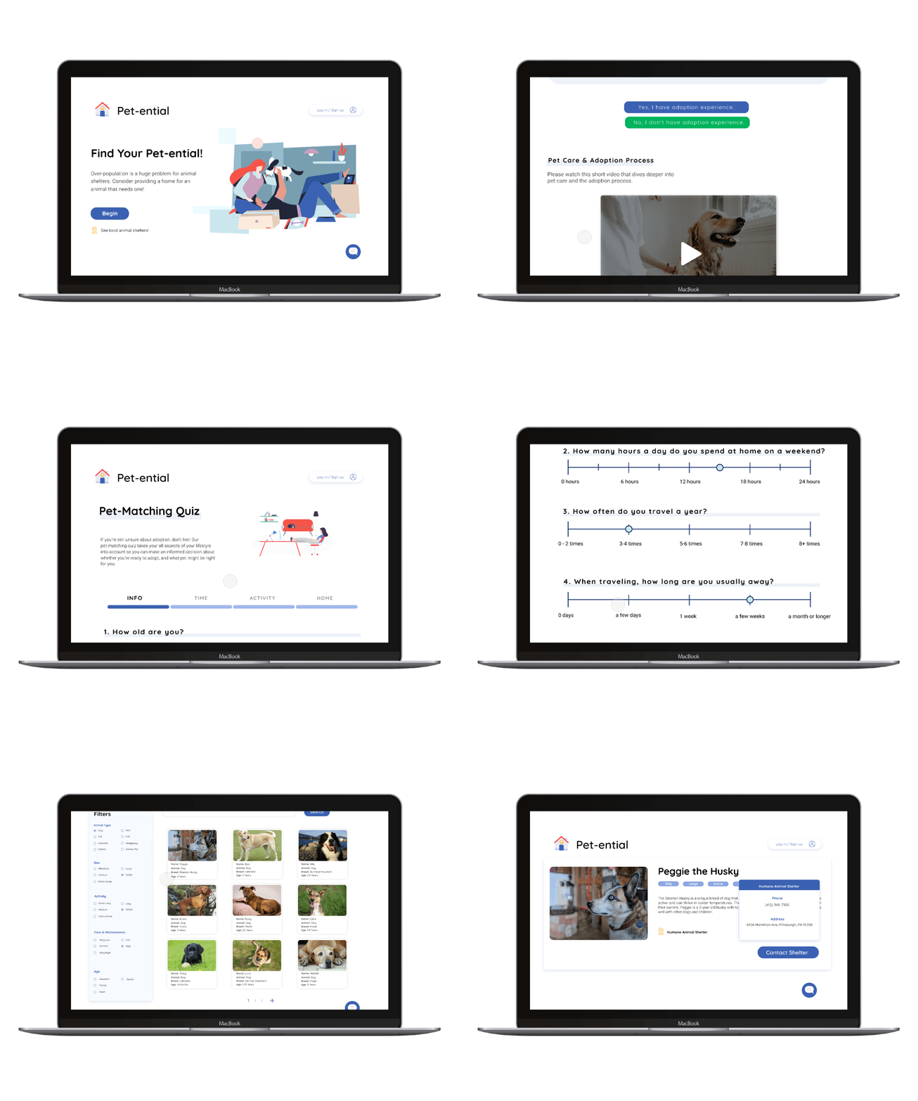
This screen is meant to be scrolled through on desktop. As users (potential pet adopters) scroll through this page, they are taught the responsibilities of pet adoption and the overall adoption process itself through the use of infographics.
To add on to the education process, we allow users to watch a video that dives deeper into pet care and the adoption process. After watching the video, users accept that they understand the responsibilities and then continue.
Pet-Matching Quiz
Users of this website would take this quiz to find out if they are ready for pet adoption or not. By answering questions in the quiz, the system will understand the user's situation and appropriately tell users whether they are ready or not.
Pet Selection Catalogue
These screens show how users can choose any pet of their desire along with enabling them to search for pets based on a different variable features. If a user took the quiz and was deemed ready, then the system would recommend some filters. The user then has the flexibility to add them or not.
PROCESS
Conducting Background Research
We started this project with an idea of the problem domain which was Pet Adoption. To get more insights into the pet adoption process, we conducted Guerrilla Research by talking to various pet adopters/owners and managers of pet adoption centres.
Additionally we conducted Secondary Research by perusing through a large number of currently used websites for adoption processes. Along with this, we searched for information on pet care and associated responsibilities.
Plotting Customer Journeys
The collated information from Guerrilla Research interviews and the Secondary Research helped us visualise emotions in the form of a Customer Journey Map. This in turn helped in identifying the key pain points that potential pet adopters and managers face in the process.
- We found that potential pet adopters did not realise the magnitude of responsibilities that are a major part of pet adoption.
- To add on to this, they were unsure of which breed or pet type was suitable for them.
- Managers and Business owners were unacquainted with the general rate of adoption and statistics related to this.

Creating Personas
The key pain points identified from the Customer Journey Map were used to create Personas. Each of these personas depict either potential pet adopters, pet centre managers or pet centre business owners affected in this domain.
Storyboarding and Speed Dating
The above personas helped us understand the goals, motivations and behavior of the users and stakeholders of the system. Based on this understanding, we ideated 15 different scenarios that the stakeholders may experience. This in turn led to subsequent creation of Storyboards. Each one of these storyboards depicts the solution to a "How might we...?" question.
Post the creation of the storyboards, we conducted Speed Dating sessions with the storyboards to validate the need for our storyboard ideas and identify any unprecedented consequences of these ideas. The ideas that ended up being the most successful were:
- How might we help customers decide which pet is right for them?
- How might we ensure that customers understand the responsibility of pet ownership?
- How might we help customers make an appropriate decision about pet adoption itself?
Mapping out the Screens
The story boarding and speed dating sessions helped us validate the ideas and thus propelled us to start visualising and building out a Screen Map. The screen map helped us to layout and structure the navigation, identify where content will sit and also show relationships between different pages. It mainly helped us build out the entire user-flow through different screens.
Creating Low Fidelity Screens
Once we had the screen map complete and laid out, we moved on to create low fidelity prototypes or Paper Prototyping of the screens themselves. This helped us place content onto each screen with much more detail and precision.
Designing the High Fidelity Solution
The paper prototypes were used as a basis for creating the final High Fidelity Screens with Interactions. We chose visually "friendly" colors to make sure that users felt comfortable while taking their own time with the website. The final designs with features, flows and interactions can be seen below.
OVERALL REFLECTION
As someone who has never owned a pet, this project enlightened me on the actual joy and pains of pet adoption. Talking to current pet owners, aspiring pet owners and pet adoption centre managers really helped me understand the problems that they face. This understanding provided a solid foundation for ideation and design of the user-flow. It's a really great feeling to create concepts that actually connect with users and obtain validation from them.


.png)


